Saturday 12 March 2011
Wednesday 8 December 2010


Wednesday 1 December 2010


Tuesday 30 November 2010


Newspaper Evaluation: Semiotics.

The front cover of this newspaper presents a mythic construction of the interests of working class men; presenting football, cricket and the X Factor to create intrigue to this target audience. However, it is played up by the middle class as much as it is projected onto them. It is also a mythic construction of masculinity and femininity; again the use of sports to connote males and porn stars and sexy santas connote females.
The picture denotes Katie Waissel and connotes innocence. Nevertheless, this contrasts to context of the text. The language used within this article is common, thus connoting that the writers of the article are speaking your language; they share your cultural code. The use of 'Shaggy Sheila' to refer to Katie's grandmother signifies porn and connotes typical pub banter; this known as orality.
The use of the red text on 'X Factor babe's shock' dramatises the idea of shock but connotes negativity. The word 'babe' connotes a commoner and the use of slang language, again in an attempt to connect with the readers cultural code.
Thursday 25 November 2010

Tuesday 23 November 2010
Modernist Graphic Design.
Modernist graphic design was a cultural response to the new condition of modernity rejecting the previous art model for this new proposal appropriate to it's time. Around 1850, graphic design was characterised by continuous innovation and the adoption of utopian ideals. It also embodied the following characteristics:
- Form follows function
- Communication
- Internationalism
- Industrialism
- Urbanisation
- Rejection of ornament
- Progress
- Rationality and reason
- Anti-historicism
- Social Morality
- Truth
- Technology
- Transformations of consciousness
- Theology
German Matchbox Design

Xavier Encinas, (2009) 'Vintage German Matchbox Design',
This German modernist design shows a rejection of ornament with it's stripped down, neutral aesthetic. It uses a sans serif typeface which rejects stylistic features to demonstrate it's eternity.


Muller-Brockmann, Vivarelli, Neuburg & Lohse, (2007) 'Neue Grafik'
Form follows functions within this spread, allowing communication to be key; a grid has been used with a flush left alignment in place to enhance this. It adopts internationalism in having the article written in three languages and no illustrations present.
'Blow-Up' 1966 Film Poster

(1966) 'Blow Up',
This poster uses photo montage creating a juxtaposition for dramatic effect. Again, it uses a sans serif typeface demonstrating this rejection of decoration and adoption of the minimalism. It also considers style secondary to function with it's aim to be to directly communicate to an audience.
Walter Allner

W.H. Allner, (1950) 'International Poster Annual '50'
This stripped down aesthetic attacks decorative styles that attempt to tap into fashionable styles; thus allowing the design not to be dated to a period of style.
Jan Tschichold
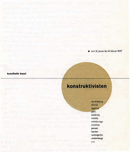
Jan Tschichold, (1937) 'Die Konstruktivisten',
The work of Jan Tschichold uses a formulaic grid system to control layout proportion and repeatedly create clear, concise compositions. He also uses separate text elements in an attempt to directly engage with the new forms of life, leisure and social affiliations.
Subscribe to:
Posts (Atom)